Print clothing often feels busy, especially later in life when comfort and clarity matter more. Many women over 60 prefer outfits which feel calm, balanced, and intentional. Research from apparel psychology studies shows patterned garments influence visual focus more than solid colors. The following guidance presents structured ways prints fit into daily wardrobes without visual overload. Each approach relies on proportion, color control, and styling discipline rather than trend chasing.
Choose Prints With Breathing Space
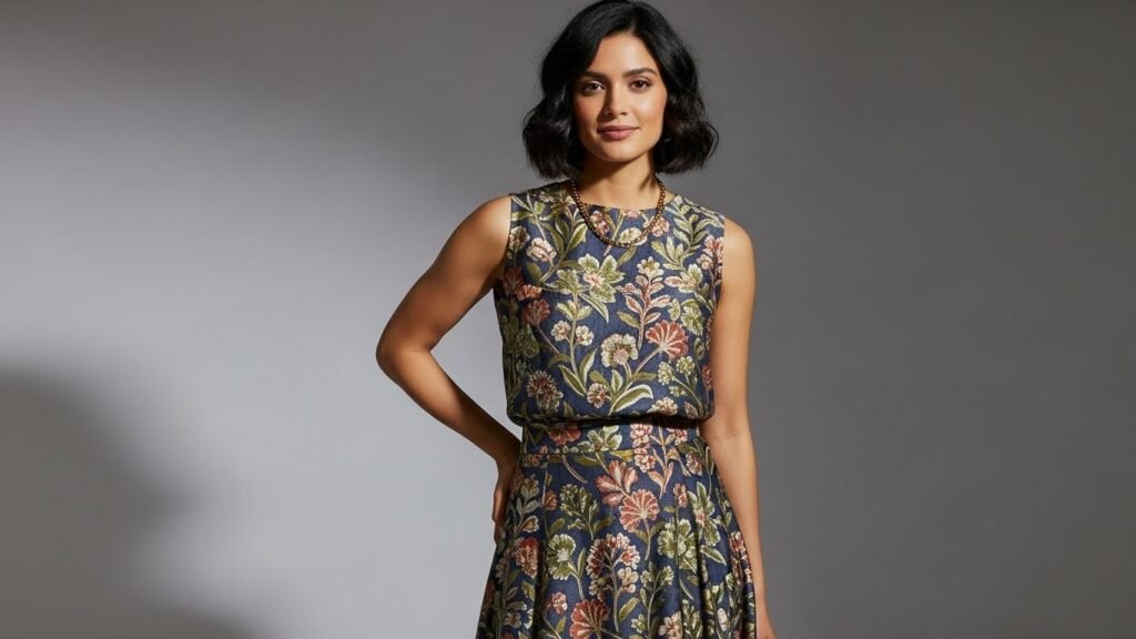
Prints with visible background space reduce visual density. Florals or geometrics spaced evenly across fabric allow the eye to rest. Apparel design research shows lower pattern frequency lowers perceived clutter. Women over 60 benefit from prints where the base color remains dominant rather than hidden.
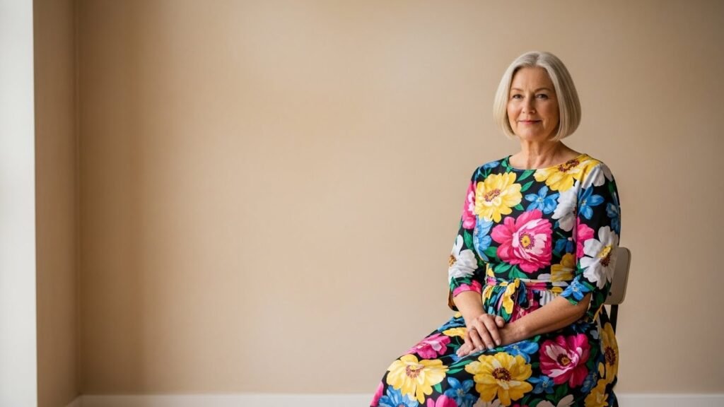
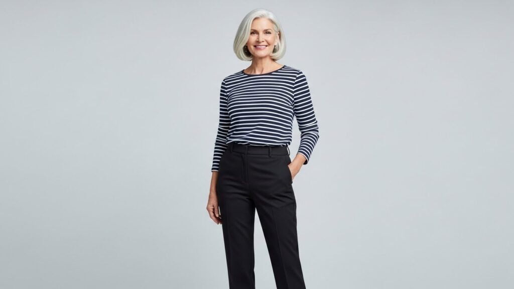
Limit Prints to One Garment

Outfits perform best when prints appear on a single piece. A patterned blouse paired with solid trousers keeps attention controlled. Visual merchandising studies confirm single focal elements improve outfit coherence. This structure supports confidence during daily wear and social settings.
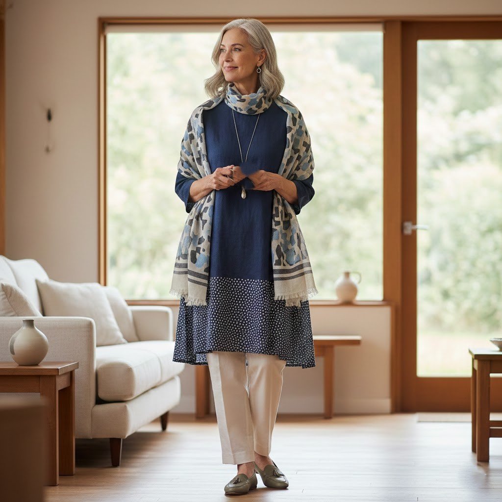
Use Neutral Color Families

Neutral shades such as navy, beige, grey, and soft olive anchor prints effectively. These colors reduce contrast intensity and soften visual impact. Color theory analysis shows lower saturation improves harmony. Prints built on neutral bases feel calmer across different lighting conditions.
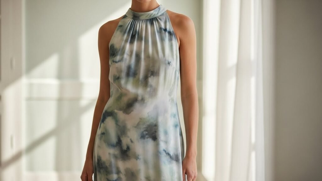
Favor Smaller Scale Patterns
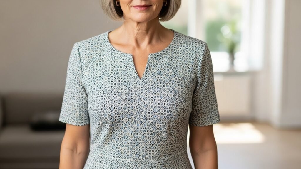
Smaller motifs create less visual noise than oversized graphics. Textile research links pattern scale to perceived body proportion. Compact prints distribute attention evenly rather than drawing focus to one area. This approach supports balanced silhouettes without distraction.
Align Prints With Body Proportion

Print placement influences balance. Vertical motifs guide the eye upward and downward smoothly. Studies on garment perception show aligned patterns enhance structure. Women over 60 benefit from prints matching natural body lines rather than fighting them.
Pair Prints With Structured Solids
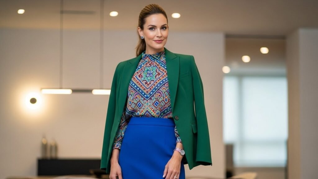
Structured solid garments provide visual stability next to prints. Tailored jackets, straight skirts, or crisp trousers frame patterned pieces. Styling analysis confirms structure offsets softness in prints. This pairing keeps outfits grounded and intentional.
Control Contrast Levels
High contrast prints attract attention quickly. Lower contrast designs blend tones within the same color family. Vision science indicates reduced contrast eases visual processing. Women over 60 often prefer prints which transition smoothly between shades.
Select Quality Fabrics Over Trends
Fabric quality affects how prints appear. Natural fibers hold patterns with clarity and softness. Textile durability studies show higher quality materials reduce distortion after wear. Clean lines and stable prints maintain polish over time.
Use Accessories as Print Anchors

Accessories that are solid can be used to stabilize patterned garments. Cohesion is enforced with belts, shoes, or handbags in similar tones. Accessory repetition made in styling audits is found to lessen visual clutter. The approach will help in uniformity among outfits.
Build Familiar Print Categories
Familiar print types feel easier to wear. Stripes, dots, or classic florals carry predictable visual rhythm. Consumer behavior research links familiarity with comfort. Repeating trusted prints supports confidence without experimentation fatigue.