
The results of the interview usually rely on the early perception created prior to the conversation. The color of clothes has a quantifiable effect on the development of trust, competence, and professionalism. Organizational psychology studies reveal that color influences the attention and the emotional response. In a few seconds, recruiters can observe dressing. The intentional use of color is going to assist in presenting the individual and the position in line with expectations and minimizing distractions in the appearance during the assessment.
Black

Black is an expression of power, order and rank. This signal commonly meets leadership, legal and finance roles. Too much black will cause alienation in teamwork. Impact can be enhanced by lightening shirts or limiting accessories. Tailoring and matte are done in structured forms to avoid harsh visual contrast in the office setting.
Navy Blue

The color navy blue is one of the most powerful interview colors. The surveys of the recruiters associate navy to trust, stability, and preparedness. There is a positive response to corporate, technical and management positions. Navy has a good level of clarity in both lighting conditions and video calls. The neutral colors and a navy jacket will not be too dominant but still encourage confidence.
Gray

Gray signals thinking, impartiality and critical attention. The approachability is supported by light gray. Charcoal gray dominates without coercion. Gray palette is more welcome in the consulting, engineering, and operations jobs. Crucially, tailoring sharp eliminates flatness. Gray is made an intentionally professional statement by clean lines and quality fabric.
White

White is organized, precise and clean. White shirts enhance facial differences and eye contact in interviews. The quality of the fabric is poor, which undermines the impact by increasing or being transparent. White is the most suitable as a base and not as a complete outfit. Attention to detail is supported by crisp presentation.
Light and Medium Blue

Soft blue shades communicate calm, cooperation, and reliability. Customer facing and team based roles benefit from this effect. Overly bright blue distracts focus. Muted tones maintain professionalism while supporting conversation flow. Shirts and blouses in controlled blue shades remain safe and adaptable.
Brown
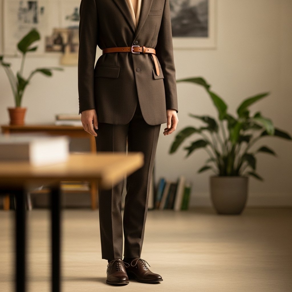
Brown reflects reliability, stability, and grounded judgment. Education, creative, and nonprofit sectors accept brown more readily. Dark brown performs better than tan shades. Structured pieces avoid casual impressions. Brown leather shoes or belts add warmth while preserving a professional appearance.
Green

Green represents balance, composure, and steadiness. Dark green works well within healthcare, research, and sustainability focused roles. Bright green disrupts formality expectations. Forest and olive shades maintain seriousness. Green functions best as a secondary color supporting a neutral base.
Red

Red attracts attention and signals assertiveness. Sales leadership roles accept controlled red accents. Full red garments overwhelm focus and raise tension. Small elements like ties or scarves limit intensity. Context awareness remains critical to avoid distraction during assessment.
Yellow and Orange

Yellow and orange project energy and enthusiasm. Interview settings rarely favor these signals. High visibility reduces perceived seriousness. Creative industries tolerate muted accents only. Primary garments in these colors draw attention away from qualifications and spoken responses.
Patterns and Multiple Colors
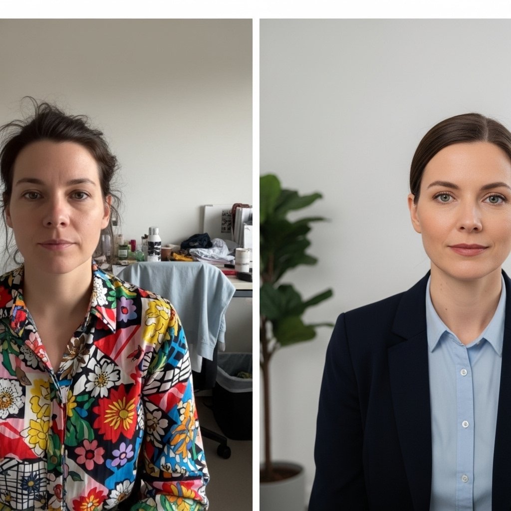
Complex patterns divide attention and reduce clarity. Recruiters prefer solid colors with minimal texture. Subtle stripes or small checks remain acceptable when contrast stays low. Multiple bold colors introduce visual noise. Simple palettes support memory retention and professional evaluation.