
Patterned shirts and ties shape first impressions in professional settings. Clothing choices signal attention to detail, judgment, and awareness of context. A study by Princeton University found observers form impressions within seconds based on appearance. Structured pattern pairing reduces visual noise and supports clarity. The guidance below focuses on repeatable rules used by stylists and menswear buyers across formal and business casual environments.
Scale Contrast Drives Balance
Pattern pairing works best when scale differs. A large check shirt pairs cleanly with a fine dotted tie. Similar scale patterns compete for attention and reduce clarity. Menswear retailers report fewer returns when scale contrast exists, since outfits photograph and wear better across lighting conditions.
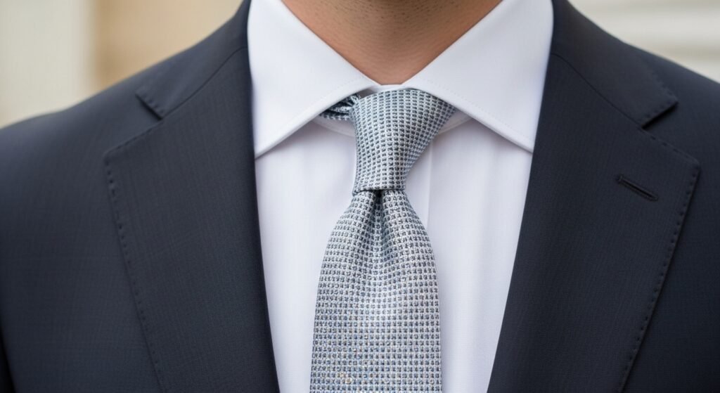
Color Anchoring Creates Control
Successful combinations anchor around one shared color. A navy striped tie with a light blue patterned shirt maintains cohesion. Without a shared tone, visual drift occurs. Retail styling teams use two color limits for business wear due to higher approval ratings in client fittings.
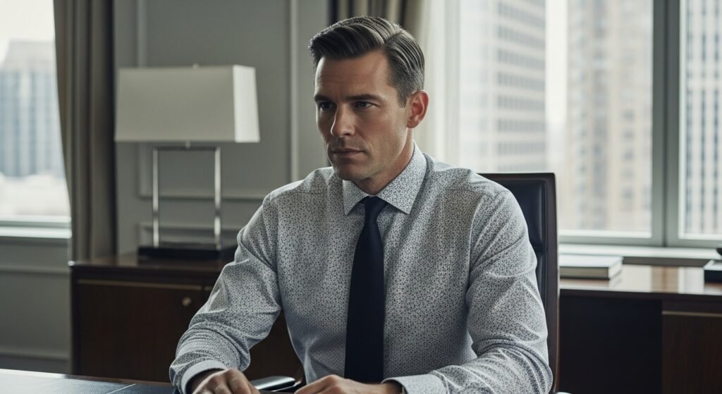
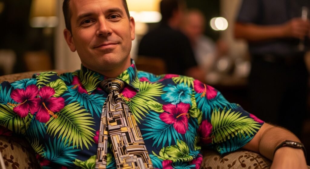
Pattern Density Affects Formality
Dense patterns read louder than sparse ones. Fine micro prints suit boardrooms, while bold florals suit social settings. Workplace dress studies show restrained density aligns with trust signals. Selecting density based on setting reduces mismatch between attire and environment.
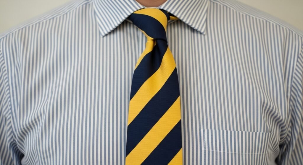
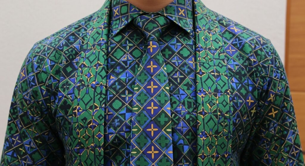
Stripe Direction Matters
Vertical stripes on shirts align well with diagonal stripes on ties. Matching directions produce rigidity. Directional contrast adds movement without chaos. Tailoring guides from Savile Row note diagonal ties soften structured shirting without breaking formality codes.
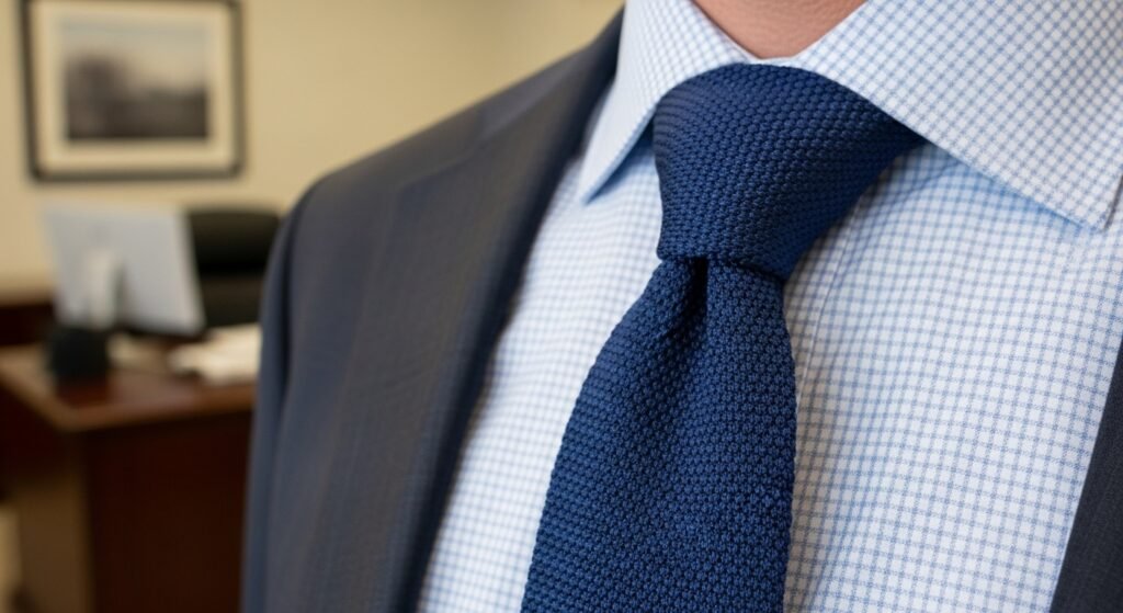
Texture Substitutes for Pattern
Texture offers variation when patterns feel excessive. A knit tie with a patterned shirt lowers visual strain. Texture adds depth without extra graphics. Fabric houses promote textured accessories for conservative offices seeking controlled individuality.
White Space Preserves Clarity

Patterns need breathing room. Shirts with visible base color support busier ties. Crowded surfaces fatigue the eye. Visual merchandising research links higher contrast ratios with stronger recall and perceived professionalism.
Season Influences Pattern Choice
Season affects acceptable contrast and weight. Summer supports lighter colors and looser motifs. Winter favors tighter patterns and deeper tones. Apparel sales data shows seasonal alignment improves outfit acceptance and reduces adjustment needs.
Tie Width Aligns With Pattern
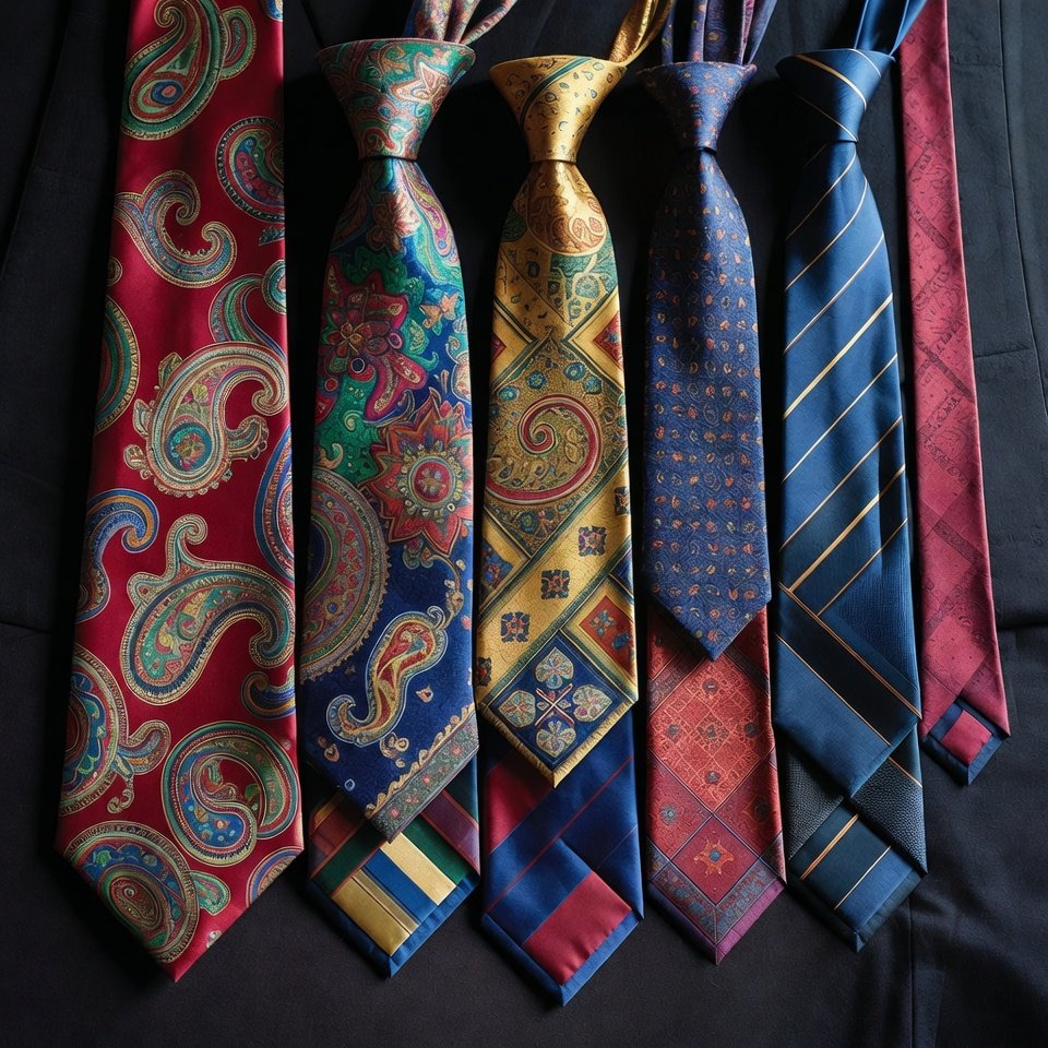
Tie width should reflect pattern scale. Wide ties support bold motifs, narrow ties suit fine prints. Mismatch creates imbalance. Fit studies from tailoring associations link proportional alignment with improved silhouette perception.
Limit Total Pattern Count
Two patterns per outfit create order. A patterned shirt and patterned tie suffice when suits remain solid. Adding more reduces focus. Corporate dress audits show lower distraction scores when pattern count stays limited.
Context Overrides Preference

Setting defines success. Client meetings demand restraint, creative roles allow range. Style preferences matter less than audience expectations. Workplace behavior studies confirm alignment with context raises perceived competence and approachability.